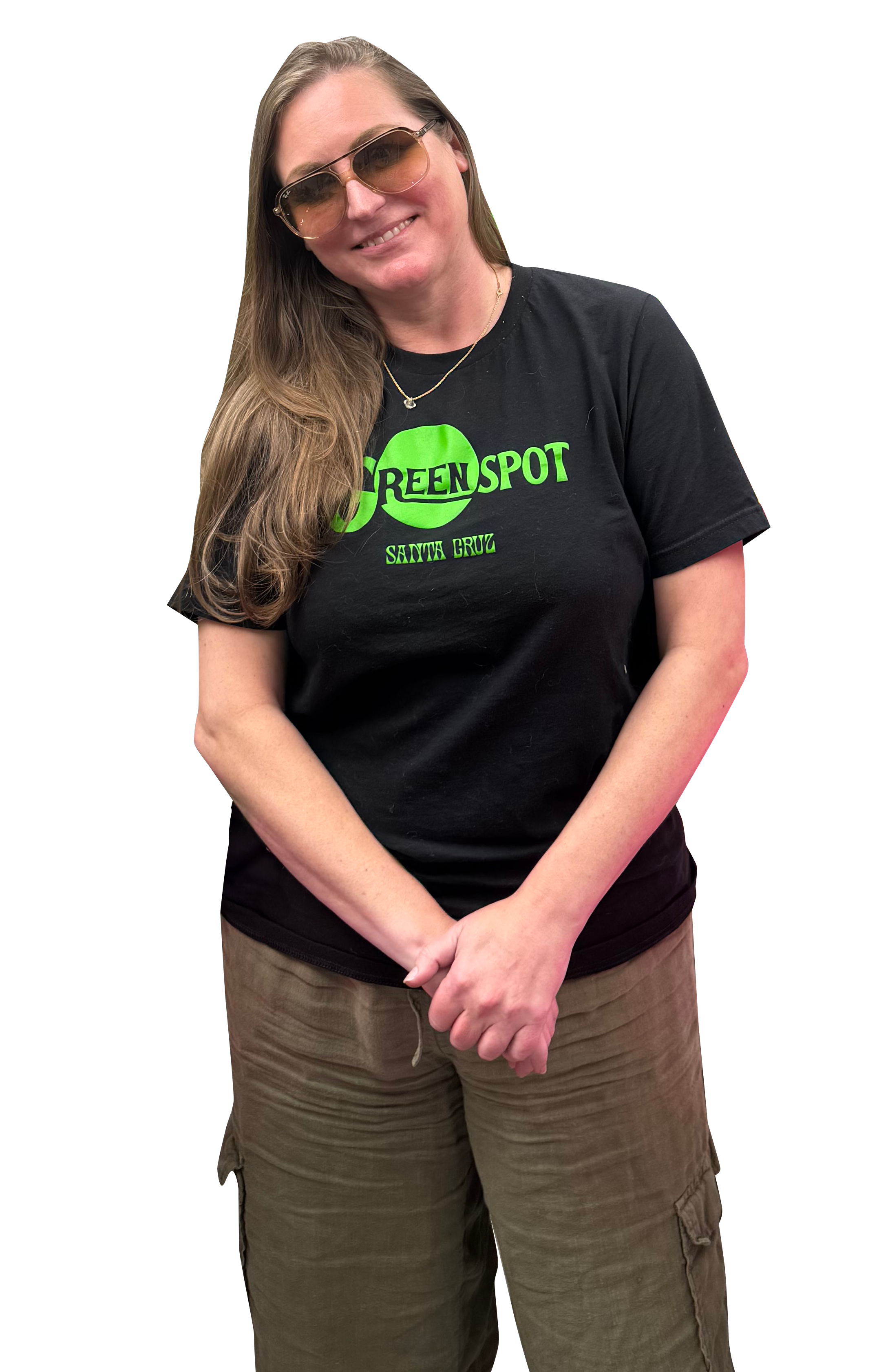
New Growth: The Green Spot Santa Cruz
A Westside Santa Cruz Rebrand
Sometimes the best projects don’t start in a boardroom.
They start at a local watering hole.
I’ve known Elizabeth since my days working in the wine and cider industry, so running into her recently felt like a full-circle moment. In between catching up, she mentioned that she and two partners had just purchased a beloved dispensary on the iconic Westside of Santa Cruz.
And just like that, the idea of working together was born.

A Beloved Local Institution
Rebranding a dispensary in Santa Cruz — especially on the Westside — is no small task. This wasn’t a brand-new startup with a blank slate. This was an established, community-loved shop with history and loyal customers.
The team already had a logo they were completely in love with.
What they needed wasn’t a new identity — it was a digital presence that finally matched the energy inside the store.
Defining the Energy
If you’ve ever stepped onto their sales floor, you know it’s anything but boring.
It’s vibrant.
It’s playful.
It’s full of personality.
In our early conversations, inspiration words like “Nickelodeon slime,” “Scooby-Doo energy,” bold greens, and layered textures were tossed around. We wanted something fun and a little wacky — but still professional and trustworthy.
Because at the end of the day, this is still a regulated industry. Credibility matters.
The balance became the heart of the project:
How do we create something bold and animated without losing trust?

The Build
What transpired is one of the most heavily custom-coded websites I’ve built to date.
We incorporated:
• Sliding silhouettes of the owners and founders
• Custom typography integrations
• Layered motion and animation
• Branded graphics built from scratch
• Strategic color overlays and bold green elements
Every detail was intentional. The motion wasn’t there just to be flashy — it was there to reflect the movement and personality of the team behind the counter.
The result feels alive, just like the shop itself.

Honoring the Past While Welcoming the Future
One of the most delicate parts of this project was renaming an established dispensary. When a space already holds meaning in a community, you have to tread carefully.
This wasn’t about erasing history.
It was about honoring it — while introducing new leadership, new energy, and a fresh chapter.
The Green Spot now has a website that reflects who they truly are: confident, playful, community-driven, and deeply rooted in Santa Cruz.
Why This Project Meant So Much
Projects like this are why I love what I do.
They combine history, friendship, creativity, and trust. They challenge me technically and creatively. They require nuance. And they remind me that branding isn’t just about fonts and colors — it’s about people.
I couldn’t be more proud of how this one turned out.
If you’re on the Westside, stop in and say hi. And if you’re a business owner ready to bring your personality to life online, I’d love to help you do the same.